sa.gov
The opportunity: The South Australian Government was seeking to improve its digital presence by modernising its main public website. With its primary audience being South Australian citizens, the site’s content contained transactions, services, rights and responsibilities.
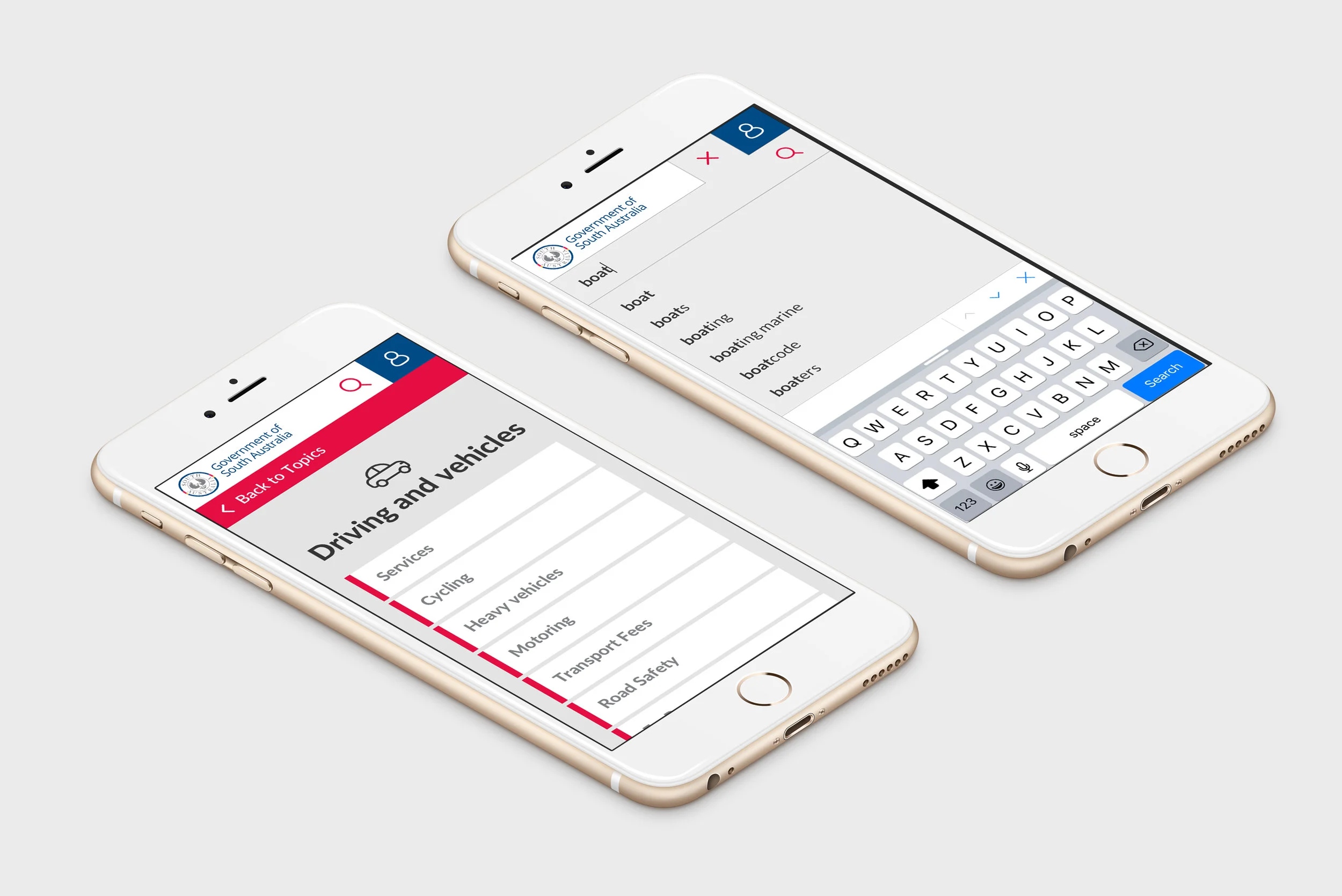
The challenge: sa.gov is a content-rich site, so navigation was a key focus. After an initial analytics review, we knew that users came to sa.gov with a specific purpose in mind, and would like to get that information as quickly as possible. We wanted them to see relevant topics quickly, so that they could perform key tasks such as renewing their driver’s license.
The approach:
- We ran a stakeholder workshop whereby business objectives, user groups and top user tasks were established. We reviewed analytics from the current site to help us understand common user patterns and pain points.
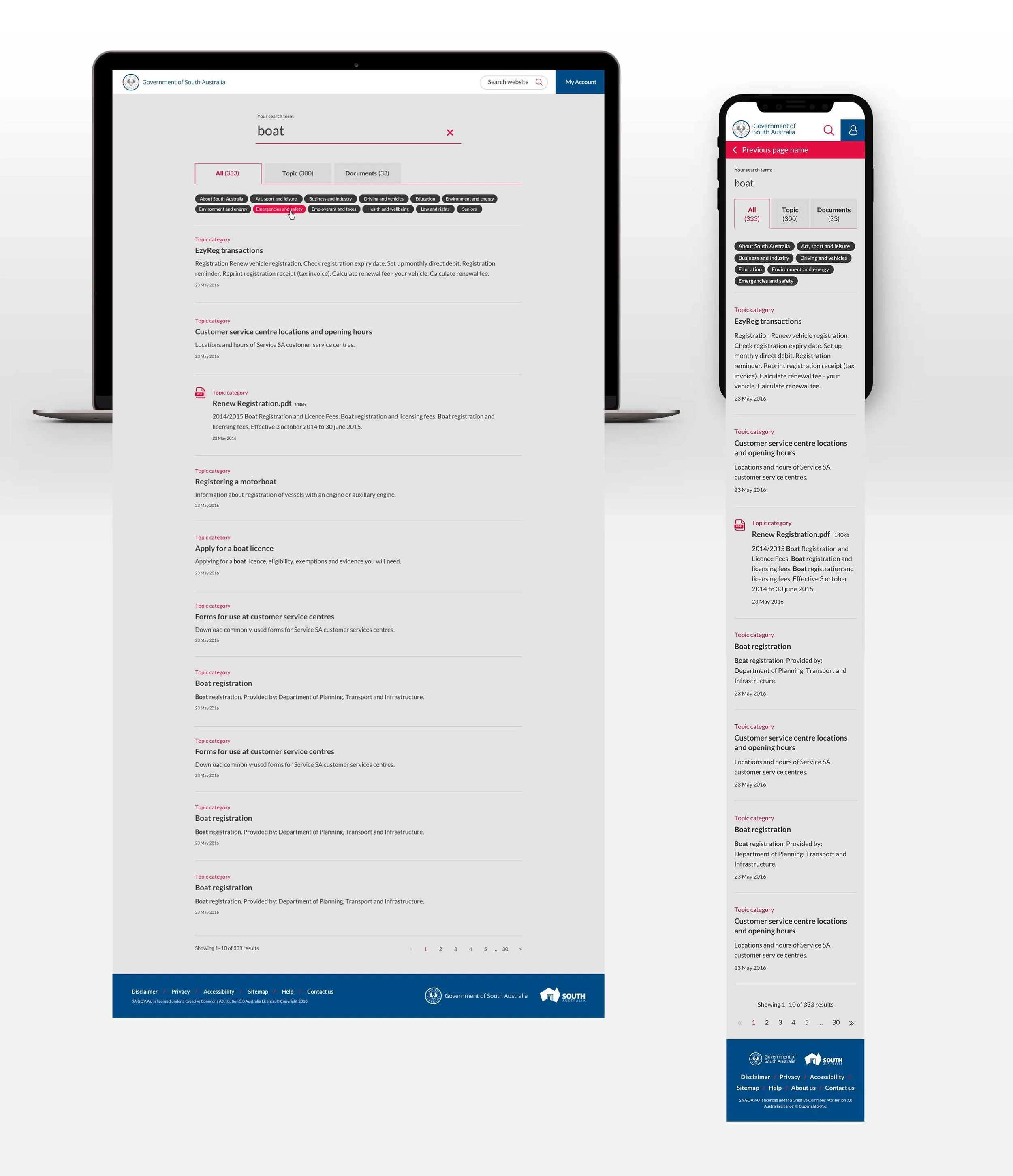
- We conducted an iterative design sprint, where we ideated on the best navigational framework for the requirements, as well as a search-focussed approach.
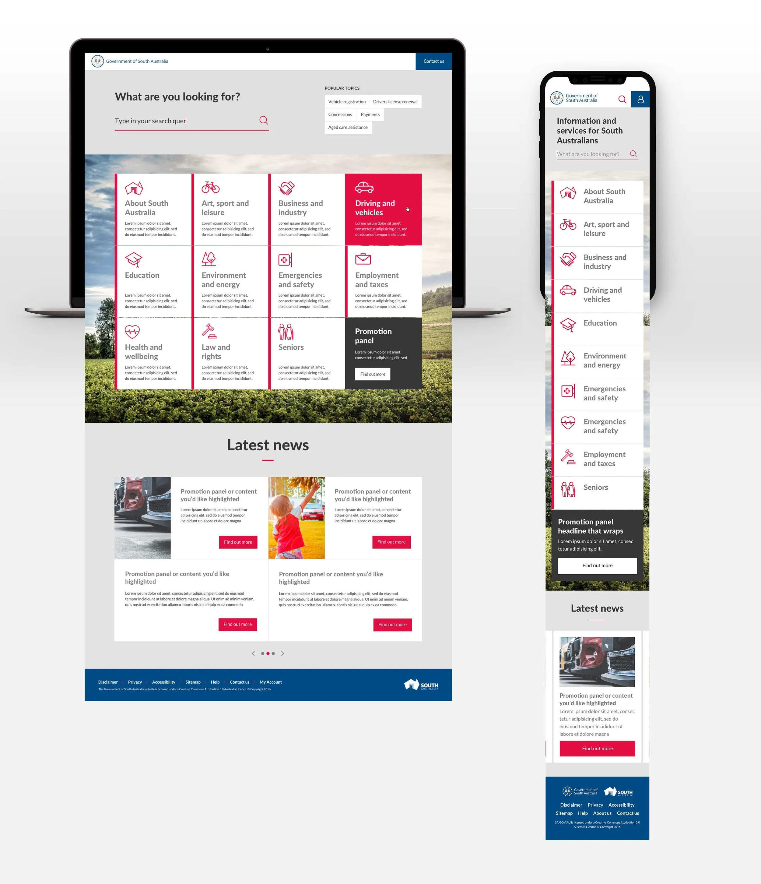
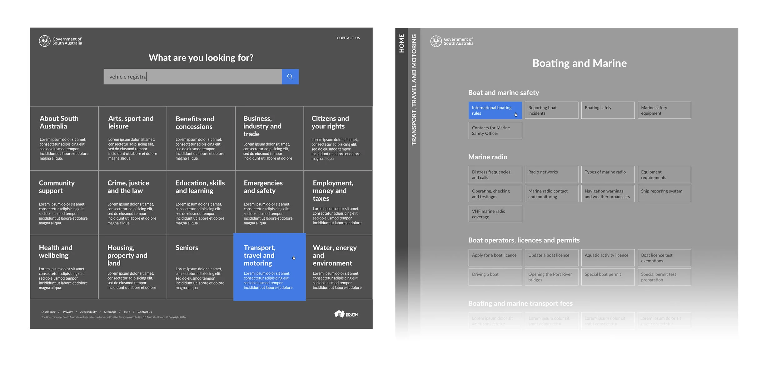
- The proposed navigation design was similar to gov.uk, in that it had 15+ top-level items, and was the primary focus on the homepage. We had previously conducted an information architecture testing session for a similar client / solution, so we used that knowledge to validate the thinking.
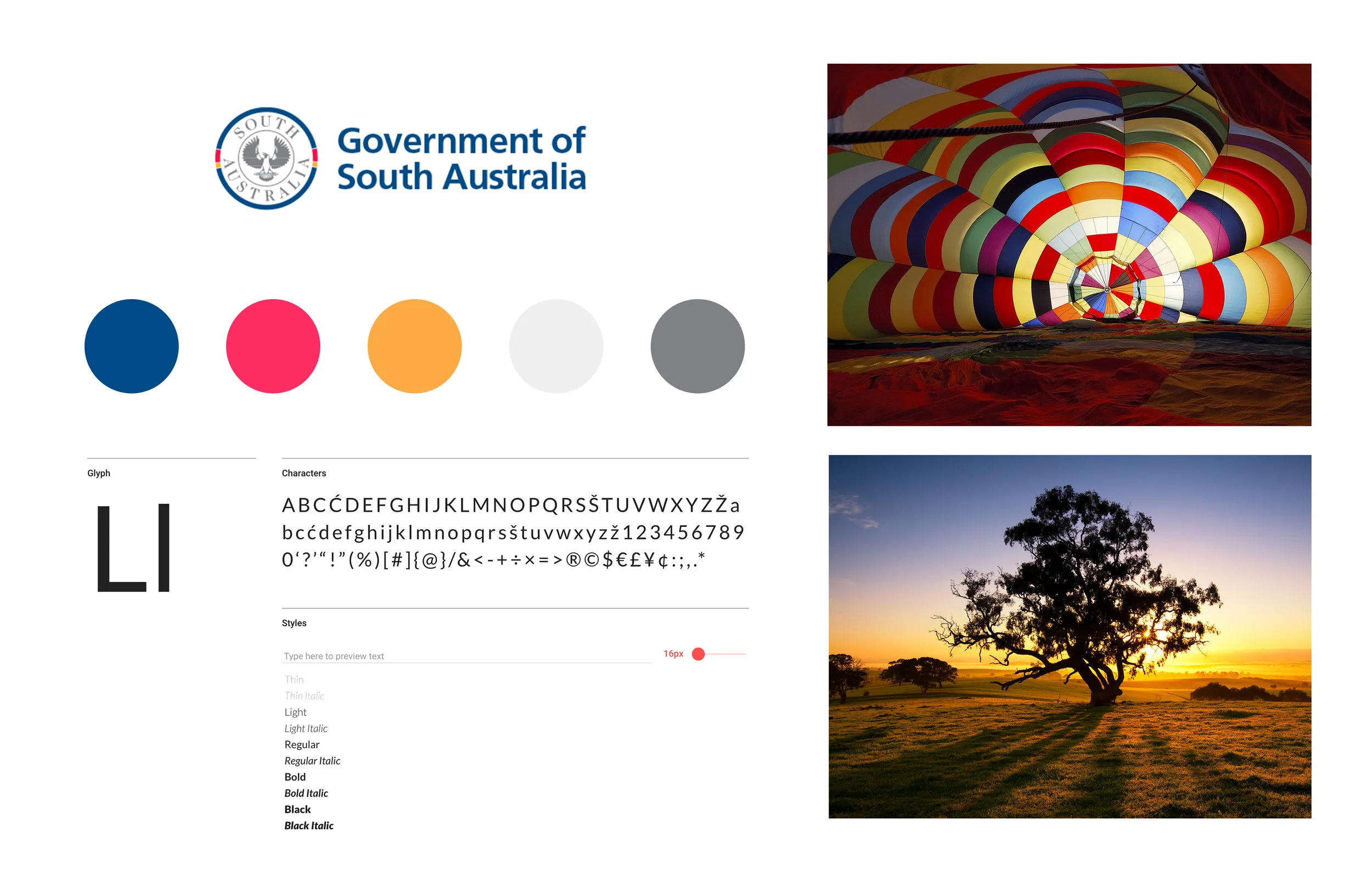
- We produced greyscale concepts and a moodboard, utilising a clean, colourful interface that would translate well to the sa.gov brand.
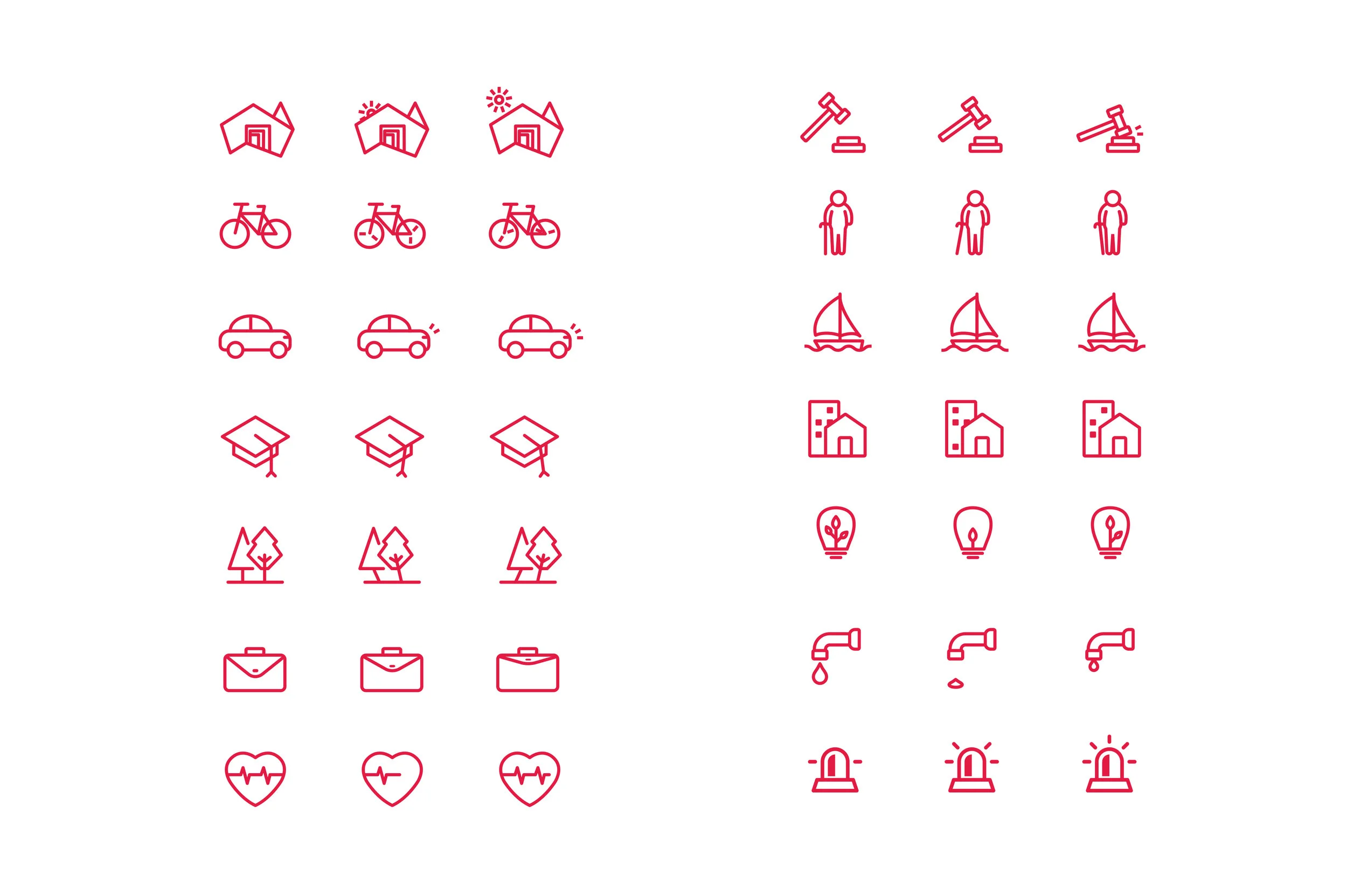
- Custom iconography was designed for each category, to help the user scan their options.
Features based on user research:
- A new, intuitive information architecture that was shallow and easy to access.
- A global sliding navigation for a quick ‘in-and-out’ experience.
- A new, clean interface, utilising micro-animation and integrating South Australia Government’s bright colour palette.
The outcome:
- A clean and fresh look and feel that responded elegantly to different devices.
- A new site meeting the WCAG 2.0 level AA standard requirement.
- A Gerry McGovern’s Customer Centric Index (CCI) was used to benchmark users’ response to the site. They were overwhelmingly positive about look and feel and found the new site “quick and easy to use – thank you”.
- The client saw a five-percentage-point increase in the proportion of people using mobile phones.
“ I just wanted to drop you a line and say I think sa.gov is fantastic. Interestingly we’ve had virtually no negative feedback and a lot of positive reaction. I love the simple, clean interface and the best thing for me is that people are now realising that simple, clear content is equally as important. The design elements that are now available to us have helped enormously with this. Of course the content job is never done, but we’re now on the right track to keep improving. ” - Barb Kempnich, Chief Editor

