Australian Capital Territory Revenue Office
The opportunity: The ACT Revenue Office was seeking to improve its digital presence by modernising its website, and creating an integrated online experience, specifically around its online tools. They wanted to provide their users with a seamless self-assessment model of taxation administration. To support this shift, it was vital to provide a comprehensive suite of intuitive calculators, and dynamic questionnaires, which would present their customers with clear guidance on their taxation liabilities and eligibility for concessions and grants.
The challenge: The Revenue Office’s site was old, outdated and had a fragmented experience. We needed to modernise and simplify the existing architecture and tools, to provide an intuitive and customer-focused structure, which would be easily maintainable and extensible. In addition, jargon was widely used throughout the site, making subjects that are already complicated even more difficult to understand.
The approach:
- We ran a stakeholder workshop whereby business objectives, user groups and top user tasks were established. We also reviewed analytics from the current site to help us understand common user patterns and pain points.
- We then conducted a content audit of the current website. This involved examining every page of the site and analysing the site structure and information hierarchy, how information is presented, as well as the language and tone of voice used throughout the site. We subsequently consolidated pages, retired unnecessary content, created new content with a focus on plain English, and developed a new, user-friendly information architecture.
- The proposed information architecture design was non-traditional, in that it had 15+ top-level items, so we wanted to validate that thinking with real users. We undertook a tree-testing session with ACT residents, and the outcome validated that the proposed solution was intuitive, well understood and easy-to-navigate.
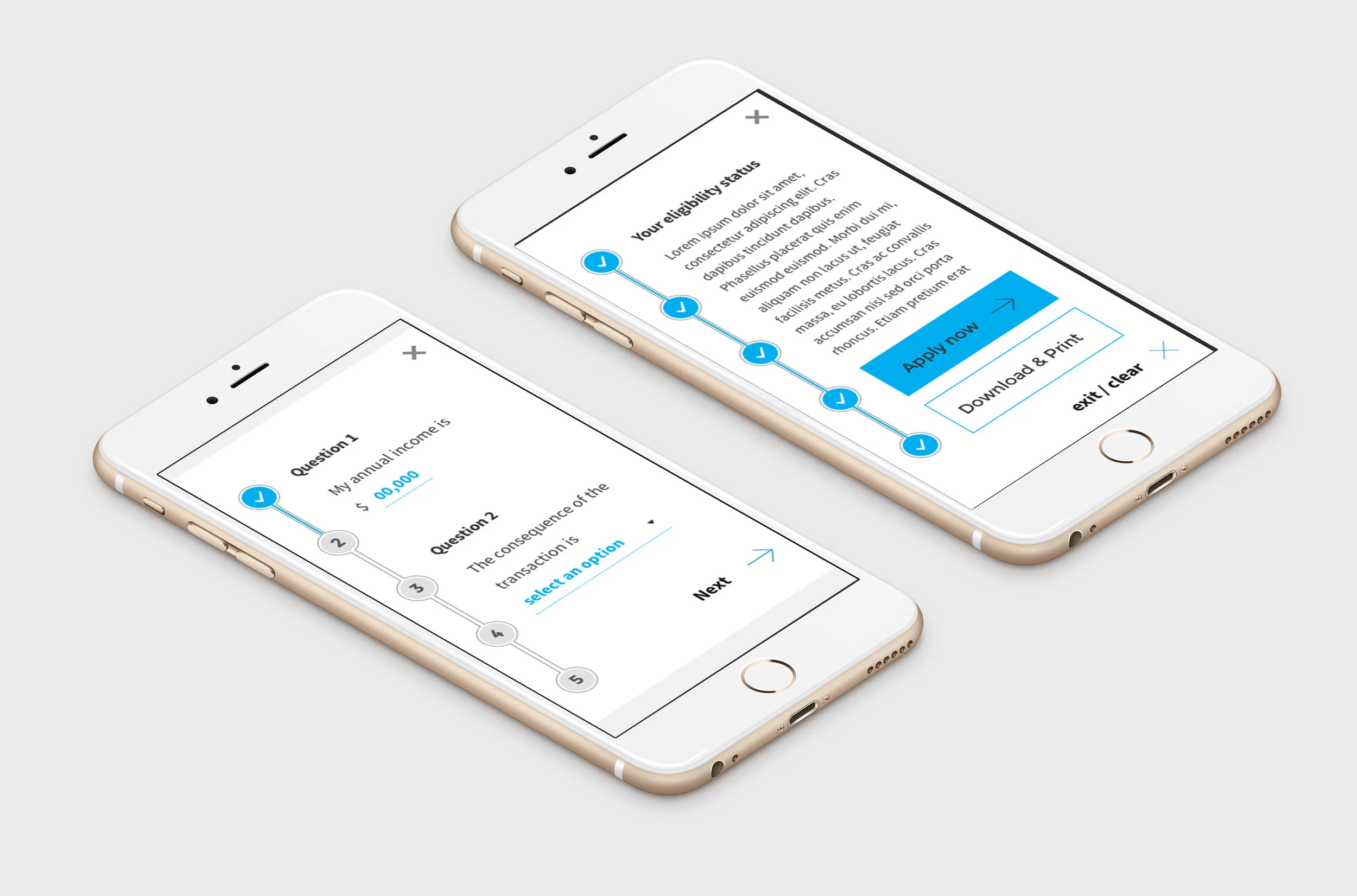
- Our business analyst lead an in-depth technical discovery of the calculators and eligibility questionnaires, and devised a simplified interactive decision tree that would provide users with a shorter, focused list of calculators and questionnaires to support their key tasks.
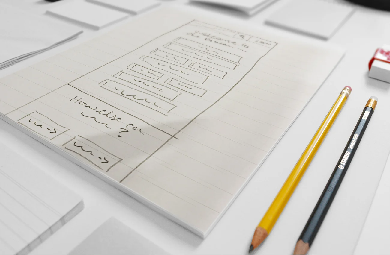
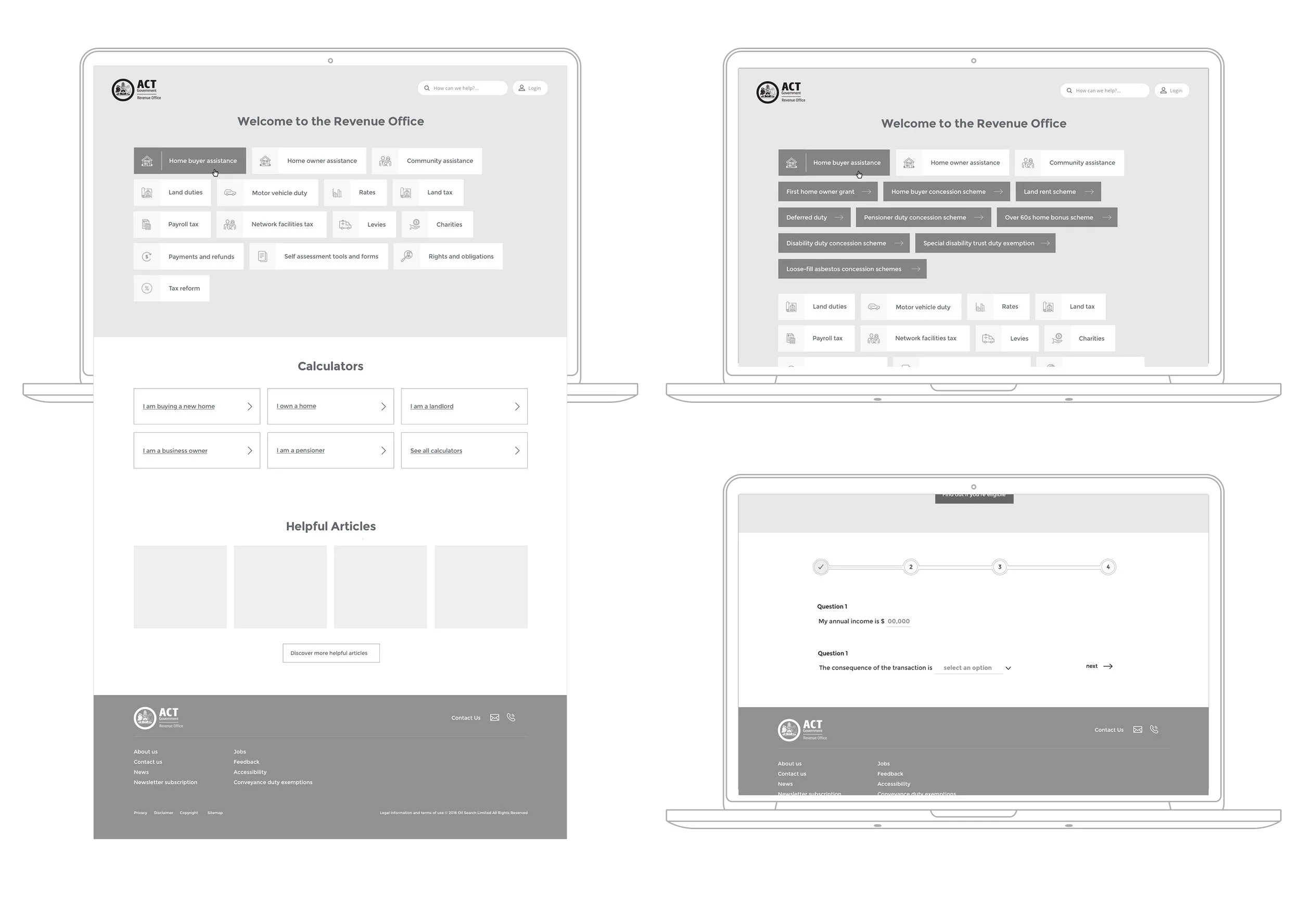
- We then assembled our multidisciplinary team together, and fed the above analysis into a sketching session. We conducted multiple refinements before arriving at a consolidated solution, that we mocked-up into a greyscale concept. We presented this to the client with an accompanying moodboard, focusing on user-friendly form systems, categorised top-level navigational frameworks and clean user interfaces that would translate well to functional components.
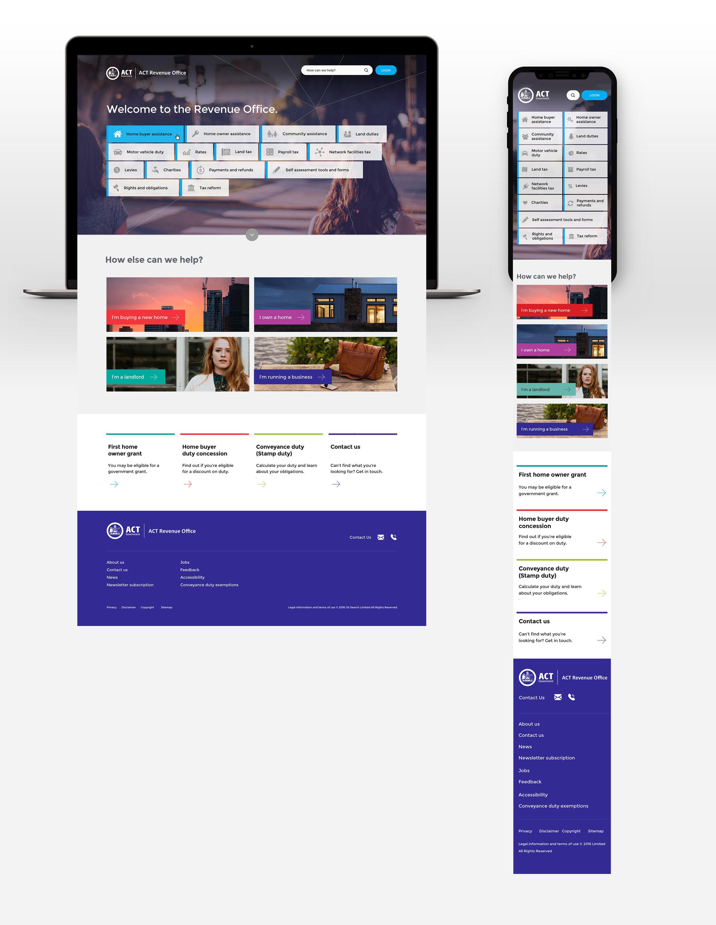
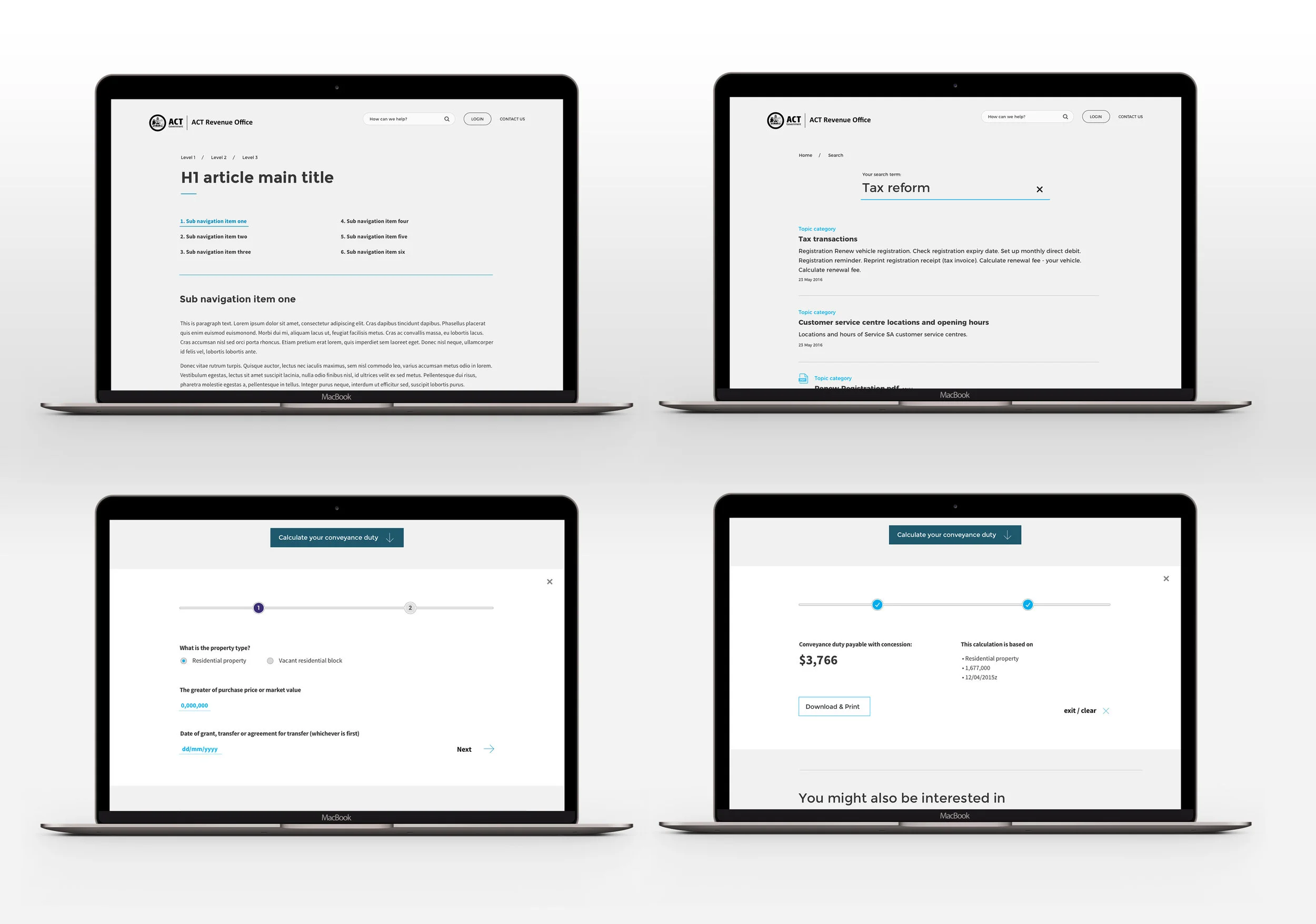
- High-fidelity user interface designs were then created for various modules and templates across all devices.
Features based on user research:
- A new, intuitive information architecture that was shallow and easy-to-access.
- Complex content simplified and re-written into plain English.
- We consolidated 14 online calculators down to three, and 70 questionnaires down to seven.
- A new, simple user interface design, utilising micro-animation and integrating ACT Government’s colourful colour palette.
- Rotating photography for the hero panel that updates on refresh.
The outcome:
- By reorganising the site structure, simplifying the language and consolidating the online tools, we made the information easier to find, understand and interact with.
- By integrating the questionnaires and calculators into the new user interface design system, we created a much easier self-assessment experience for the user.
“The design presentation was very impressive, thanks again to the whole team for their efforts.” - James Strickland, ACT Revenue Office
“ I for one am excited!” - Robyn Bradley, ACT Revenue Office

